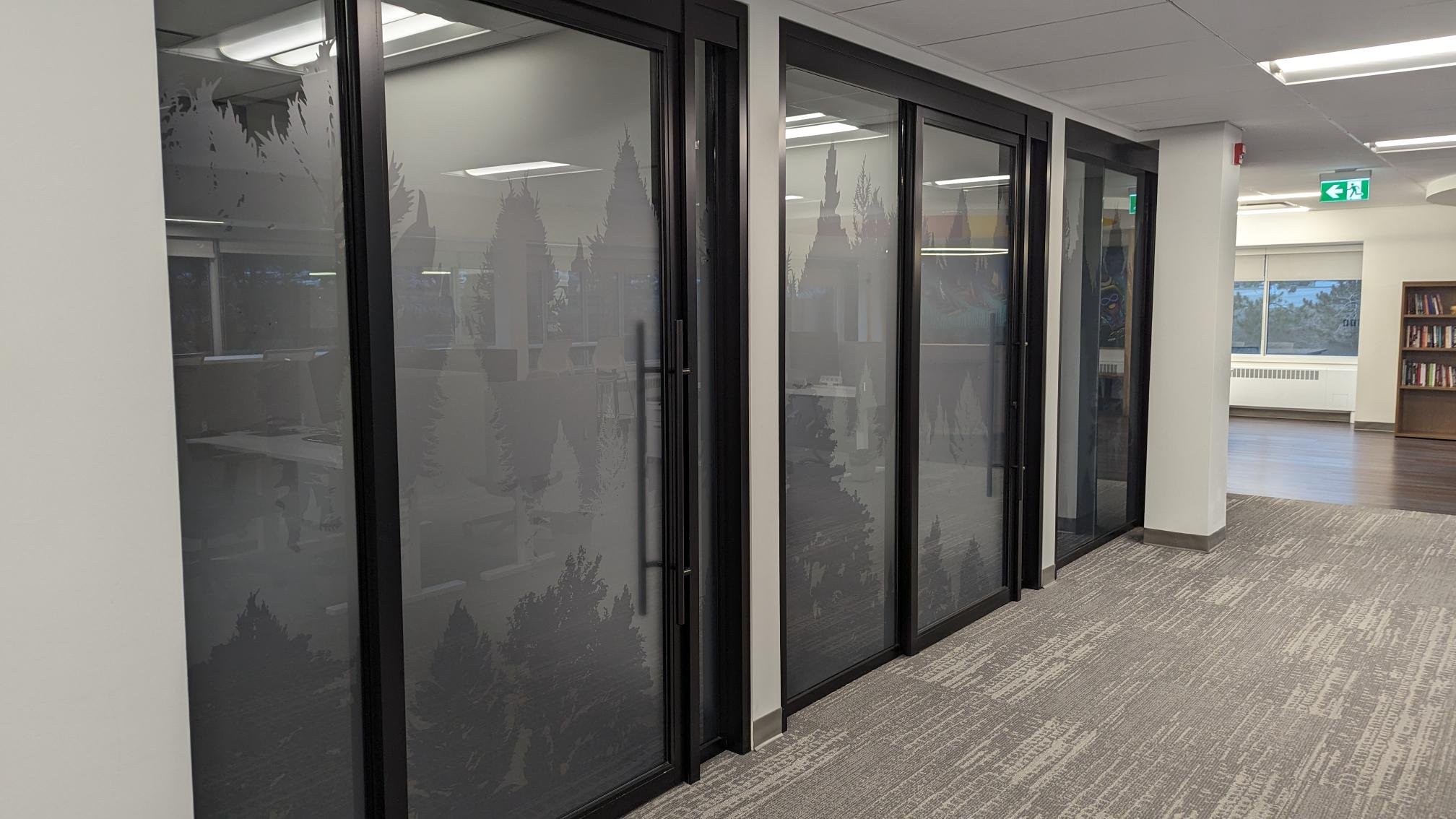
Public Health Sudbury & Districts Office Privacy Film
(Paris Street Office)
My Role:
Lead Graphic Designer
Objectives:
Create a variety of layers of privacy on glass walls through the building for different needs (ex. Client Areas, Lunch Rooms, Meeting Rooms, and Private Offices)
Incorporate organic shapes/imagery to tie into the wood accents in the reception area
Represent the Northern Ontario values of Public Health Sudbury & Districts
Be more dynamic and visual than standard privacy film on glass
Allow adequate light into offices, and not make them too dark while maintaining privacy
Outcomes:
Created 3 different densities of privacy film which feature Northern Ontario treelines, and leaves to be used throughout the building. Light density film was used in areas such as Staff Lunch Rooms, medium density to be used in areas such as Internal Meeting Rooms, and high density to be used in Boardrooms and Management Private Offices.
Staff felt the organic shapes of the privacy film contrasted well against some of the stark minimalist paint choices in the office after the renovation (such as light grey walls and black metal trim), and brought much needed life to the space for staff working within it.
Created needed privacy while maintaining light flow throughout the building.
Design Process:
Through consultation with senior management, a couple of identifying desires arose surrounding privacy film such as: allowing as much light flow as possible, playing off the organic wood accents in the reception area, maintaining privacy in confidential areas, maintaining client privacy in clinical areas, a “Northern Ontario feel”, variety of densities with a throughline for consistency.
After these consultations concluded, designs started to find something that met all the needs identified, but also echoed some existing Public Health branding. As the agency branding did not contain any organic shapes, we quickly looked to things in nature that echoed elements in our branding. We fell upon how treelines could mimic the geometric “bars” the agency uses on all of its promotional materials. After looking through examples and photographs of Northern Ontario trees, the design began to take shape and included a variety of tree silhouettes in a similar layered approach to the angle of our “bar” element.
Throughout the design process, we encouraged introducing colour into the privacy film as a way of addressing staff concerns on the lack of “life” in the building, however due to clients nervousness leaned into a more standard “frosted glass” approach in colouring, using different opacities of grey to create that overlaid layer approach, and not lose any lighting passing through.
After a couple rounds of refinements, we created a set of 3 cohesive but differing densities of privacy film which feature Northern Ontario treelines, and leaves to be used throughout the building.


